


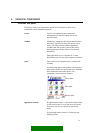
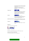
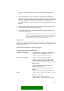
 Filter
 Top Products
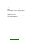
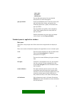
design guideline, the number of tabs should be kept
low (max 6 recommended), and the number should
not be dynamic.
(See Tabs in section Interaction style for a
description of their effect on navigation within an
application.)
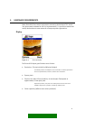
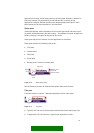
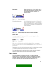
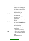
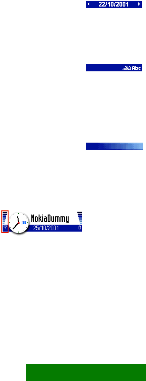
Navigation text
Figure 3-7. Navigation text.
Navigation text is displayed in the navi pane when
there are similar items to be browsed by scrolling
horizontally, e.g. dates in a calendar. Arrow
indicators in both ends of the pane indicate the
possibility to scroll.
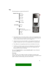
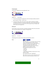
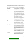
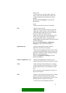
Indicators
Figure 3-8. Indicators in the navi pane.
In editors the navi pane contains editing indicators.
(See the section Indicators for a more detailed
description of navi pane indicators.)
Application-specific content When none of the above content types is suitable,
the navi pane content can be designed specifically
for an application.
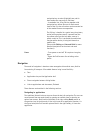
Empty pane
Figure 3-9. Empty navi pane.
The navi pane can be empty. A graphic is provided
for this.
Signal pane
Displays the cellular signal strength indicator.
Figure 3-10. Signal pane (left).
The indicator may also contain information about GPRS connection status.
Battery pane / Universal indicator pane
This area of the status pane is used in two different ways.
15