Partial items are not visible: when the list/grid pane area does not exactly
correspond to an integer number of items, the remaining area outside the last
fully visible item appears empty, displaying the background of the particular
pane.
·
Column structure of lists
For visual consistency, the standard list layouts are built around a structure of three
virtual columns. The column borders are aligned with the sides of the context pane.
The width of list items can be divided in three sections (columns A, B and C), starting
from left. All three columns need not be used separately in a list layout:
combinations AB, BC or ABC are possible. However, all items within a list must use
the same column layout. Additional indicator icons can be displayed in the right edge
of column C, as seen in the example b) below. The area for these indicators is not
really a column in the same sense as the other three, as it can be used dynamically,
item by item.
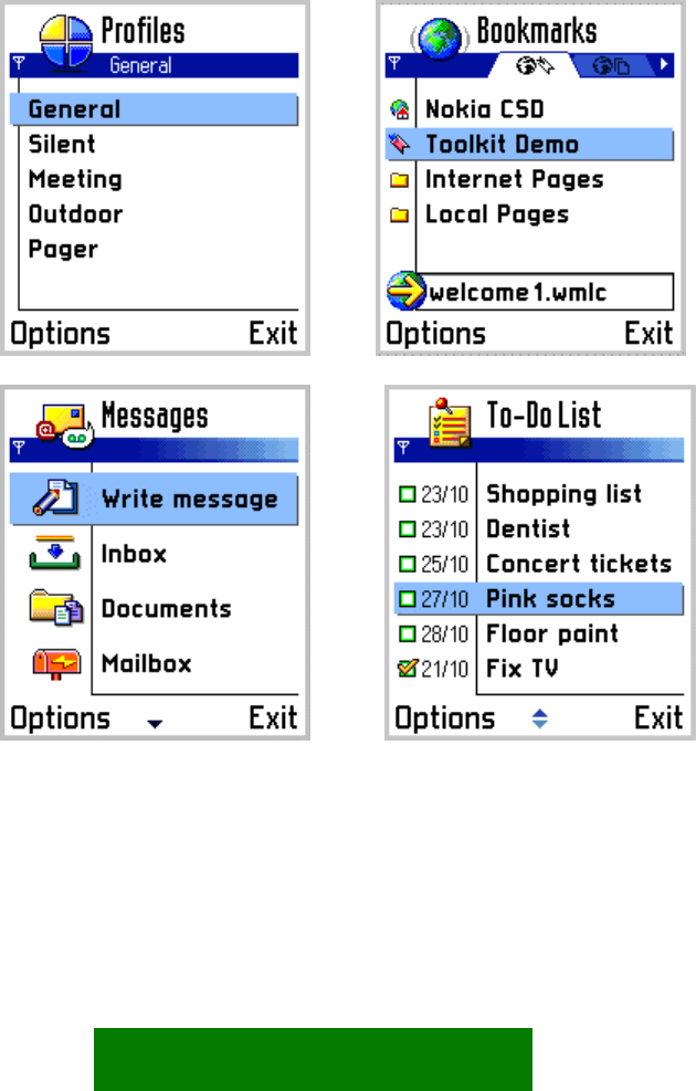
a) b)
c) d)
Figure 5-22. Different column arrangements:
a) All columns used for text item.
b) Column A contains icon, columns B&C combined for text.
c) Columns A&B combined for large icon, column C contains text.
d) Column A: icon; column B: label; column C: text.
44


