The indicator is situated in the control pane, and it consists of two arrow images, one
pointing up and the other one down. The colours of the arrows depend on the
position of the focus, so that towards the list’s beginning, the upward arrow image
becomes less noticeable and eventually (when on the first item) disappears, and vice
versa. So clearly visible arrows always point in the direction which has the larger
number of items in the list.
The scrolling indicator is displayed with all list types, with main pane lists as well as
pop-up window lists.
The scrolling indicator functions as specified above also when the list is a loop –
there is a distinctive change in the indicator at the moment the list loops.
Order of items and browsing in grids
In a grid the available items are in a rectangular arrangement of cells and browsing
is possible in four directions. In addition to up and down functions, the user can
press scroll right to move the focus one step right, or press scroll left to move the
focus one step left.
The number of items can be larger than what fits in the view so the grid items may
scroll in the view when browsing.
The preferred scrolling dimension is vertical; this means that when more items
are added, the number of items in a grid grows downward line by line, but not
outside the window to the left or right.
·
·
·
A grid should not be scrollable in both dimensions; it is acceptable only in cases
where the grid has a natural geometry that can’t be changed. A calendar’s month
view is an example of this kind of geometry (but even in that case it is better to
fit the whole month on screen rather than make it scrollable in both dimensions).
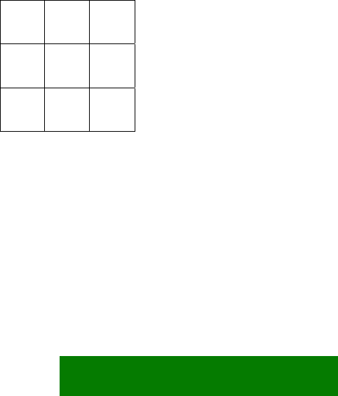
The default filling order of choice items in a grid is first left–to–right, then top-
to-bottom.
1 2 3
4 5 6
7 8 9
Figure 5-4. Default grid filling order.
It may happen that a grid is not filled completely. Depending on the application, the
grid can be auto-filling (cells moved within the grid so that empty cells in the middle
get filled), in which case there can only be empty cells on the rightmost part of the
last line. Other applications may allow empty cells anywhere, so that the grid can be
sparse.
28


